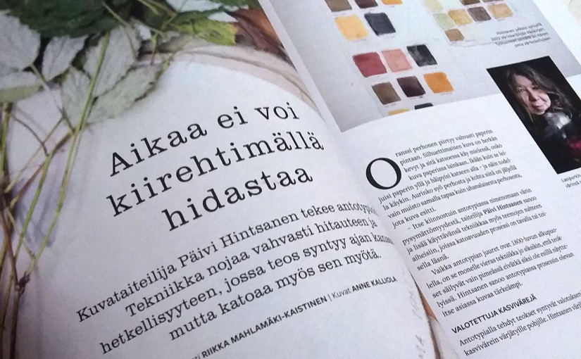
I was happy to give an interview about my work with anthotypes to Finnish craft and creative magazine Taito. In four-page article I tell about my passion for natural dyes and about the beautiful uncertainty of anthotypes.
More to come
I’ve received a few queries about my project recently – I’m still continuing the project which will be updated to this page really soon. This has been a bad time for me, as I have been unable to work almost the whole year. I have worked, however, a few hours now and then, I’ve just not had enough energy to document all my processes. There are about fifty more samples and almost eighty exposured images to be shown here in my Anthotypical blog, after I’ll get well enough to continue this project weekly. Which will be in just a few months time (and I’m so happy about it).
So, please, stay tuned for more updated project information and more anthotype posts soon!
Behind the scenes
I haven’t written blog for some time now – because my work this autumn has been this slow, silent work behind the scenes. I’ve been documenting the results from this summer, searching for background information and writing – and planning. This slow work is very time-consuming, and since my working grant will end after this year, I know I can’t continue with this process next year in the same volume as now. I will continue, no question about it, but it’s much more harder, when I can’t focus on the work in the same way as I can now. That’s why I’m using every second of the rest of this time to these processes that will be hard to find later! (This Kone Foundation grant has really been blessing for me and my work, also making grounds to my future work with natural dyes.)
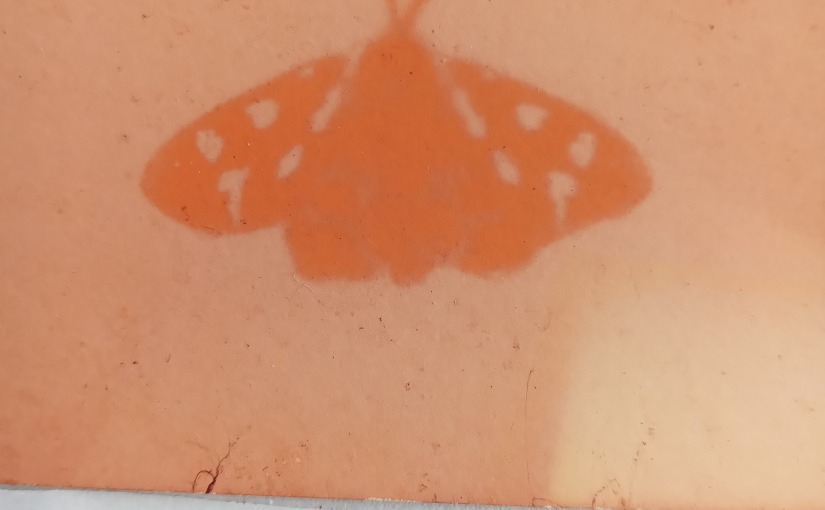
This is a documentary snapshot of one of the (endangered) butterflies I exposured last summer. I’ll probably photograph these only at the beginning of next year in one bigger sessions. But I’m pretty sure I’ll be able to post some results of this year’s exposure and dye experiments in December so you’ll see more of these poor(ish) quality snapshots soon! 😀
Konstrundan 2022
Today was the day I finally took down my butterfly films after 3,5 months exposure time. Some of them were beautiful crisp prints, and some of them more soft blurred ones, but all together all succeeded in some way. There were surprises though, and some of the prints were so double exposured or over exposured, I need to make another try (and because the dark, northern winter is coming, I know what I’ll be doing next summer).
I will show this project (and for the very first time ever, some final prints) in Konstrundan event at my studio on Saturday and Sunday, Sept 3-4, from 11am to 5pm. I’ll also have my test papers shown and I’m glad to talk about natural dyes and pigments – and about colours in general. Please, feel welcome to drop by!
So close but yet…
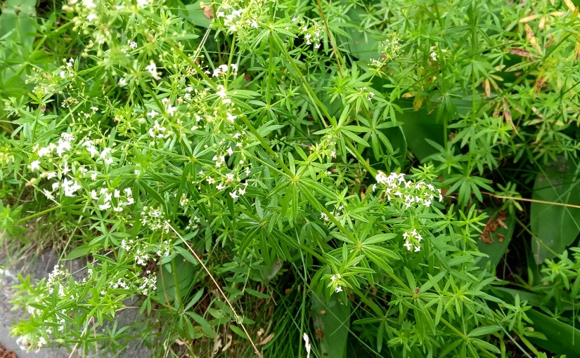
Garden lupine is an invasive species in Finland and for the last few decades it has taken over every place. As pretty as it is, it just smothers the native plants. For the last few years the measures have been taken to root out those invasive garden lupines, and even though they still grow plenty in several places, I’m so glad to see that it has been worth it. These bedstraws were common in my childhood, but I’ve really not seen many of them for some years, and this summer they are growing all around.
Though, when looking through natural dyer’s lenses, this is the most frustrating view… Dye madder doesn’t grow (naturally) in Finland, but these bedstraws (genus Galium) are little cousins of dye madders (genus Rubia): their roots yield same alizarine colour matter as madders (and in fact, the Finnish name for the plant genus is matara). The only thing is, that while Finnish everyman’s rights are quite extensive and you can pick plants almost everywhere unless they are not protected or located in someone’s backyard, you can’t pull out roots without the landowner’s permission. So, here they are, growing around again, and as far away as ever…
A week ago we did an inspiring dye plant walk around with my dear friend Ulla Lapiolahti with our guest Leonardo Hidalgo and I told them about bedstraw field growing nearby where I live, close to the public swimming pool. There were so many of them that I thought to contact the city of Jyväskylä (who owns the land) and ask for permission to pull out a couple of dozens of roots just to make a tiny dye bath for my sample papers and yarns. This was on my to do list just a few days too long: as I walked by a few days later, I noticed that they had started a renovation work at the site, and all those bedstraws were gone as they had moved earth on the surroundings! Not worried about the bedstraws – they will grow back – but my slowliness. I’d probably got the permission to pick the roots as they were about to be demolished anyway, and from them I’d got quite a large batch of dye.
Bedstraws are getting more common again then, but I haven’t seen such fields nowhere else. The plant parts above the ground also yield yellow, but since there’s so much yellow in other plants too, I won’t pick them for that.
But now I’m constantly looking around of bedstraw fields and if I find one, I’ll be quick to ask permission…
Quest for blue with garden lupine continues
I almost did it – I did get blue lupine dyed paper, but for just one day!
While ago I found a study (unfortunately I lost the original source!) which stated the dyeing matters in blue / purple garden lupine (komealupiini; Lupinus polyphyllus) flowers to be blue and purple delphinidin 3-(6″-malonyleglukoside and yellow apigenin 7-(6″-malonyleglukoside.
Delphinidin is a blue or purple anthocyanin, which also give colour to flowers of genera Viola (pansy; orvokit) and Delphinium (larkspur; ritarinkannukset – and btw – hence the latin genus name) and causes the purplish colour of Cabernet Sauvignon wine (and also present in for example blueberries). I’ve dyed several yarns with garden lupine flowers and every time the result has been a bit different. I haven’t really thought about it much – just that it would be normal variation of natural dyes, picked in various times from several places and also I’ve thought that the deepness of the lupine flower colour has had something to do with it.
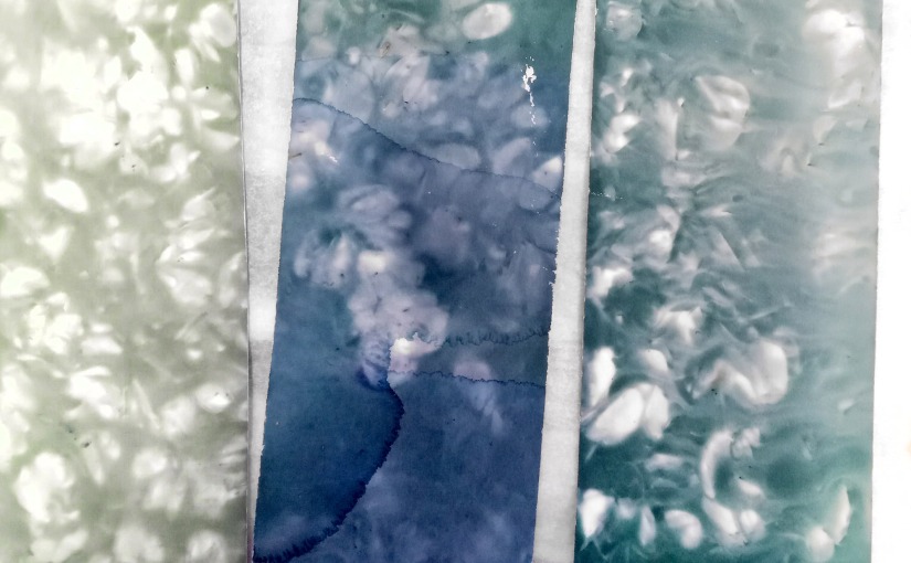
It was only now when it occured to me that delphinidin is anthocyanidin, and all anthocyanidins are pH-sensitive. They usually turn red in basic solution and blue in acidic solution. So, if I add vinegar…
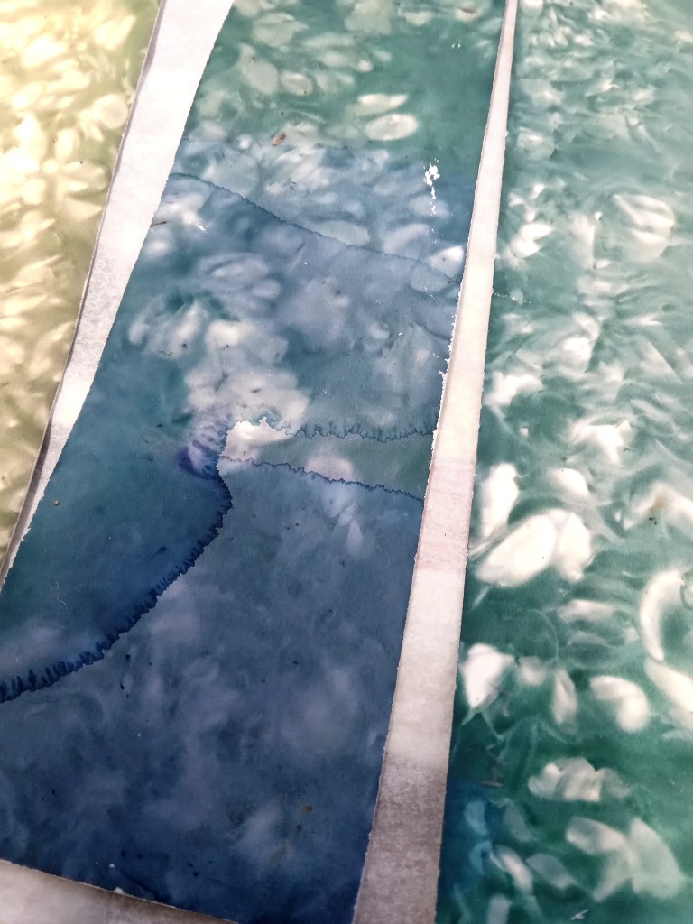
And I did. I of course tried this on already dried test papers, by brushing house hold vinegar (10%) which turned the paper in seconds into purplish blue, and then another stripe of 1 part household vinegar and 3 parts water, which made quite a good middle blue. The test-paper can be seen in the middle; the top of the paper is the original dye colour before adding vinegar. (I also made the same test with my sample yarns, of which I will post separately soon.)
I tested vinegar also to another lupine dyed paper strip, which had been in a dye bath just for a really short time, and the dye hadn’t really got to it well. There were some green patterns on a yellow base, but when I brushed the top of this paper household vinegar, I noticed two things happening: green dye changed to blue, but also yellow colour turning seemingly more light and more colourless. As said before, the yellow colour comes from apigenin which is one of the flavones, also known as Natural Yellow 1, and it very abundant in chamomile plants and the other of the main dye matters in weld (Reseda luteola; värireseda; the other is luteolin).
This was surprise, since I’ve been thinking that apigenin is not really pH sensitive. Then I remembered reading somewhere, that if dye bath is below pH5, you can’t dye with apigenin, since it just doesn’t react. I don’t know if this is true or not, and I haven’t found the original source, but I remember that much that the text said only about dyeing in acidic, not that the dye itself would be affected. I need to make a thorough search for this one day (can’t make it now).
Anyway: this reaction made me wonder, if it was the acidity that brought out the blue, or was it that the vinegar deleted the yellow from the green, or maybe it was the both?

Later I continued brushing the other end of this paper with washing soda solution pH11, which turned the paper more on kind of ochre yellow side (not reddish one though). It looks like diluted washing soda solution pH9 didn’t affect at all.
I don’t know why I haven’t tried changing pH of garden lupine dye bath before! Well, there’s one obvious reason for not testing acids: I’ve tried to keep away from acidic additions since cellulose fibre papers (cotton and other art papers) do really not like acidic surroundings, but they should always be on basic; at least acid free, but pH7-pH8 would be optimal for them not to become brittle. I do make a process where dyes are fading, but still I want my papers to be archival, and acid simply destroys the archival feature.
So, at this point I already knew that this way to get garden lupine blue is really not the solution I’m searching for this project, but interesting phenomenom anyway. I made a twenty points list of the tests I should still do with garden lupine flowers, and now I added a few more pH tests – I’d really like to see if changing pH of dyebath before dyeing affects on how the paper (or yarn) is dyed, and how the temperature affects, and…
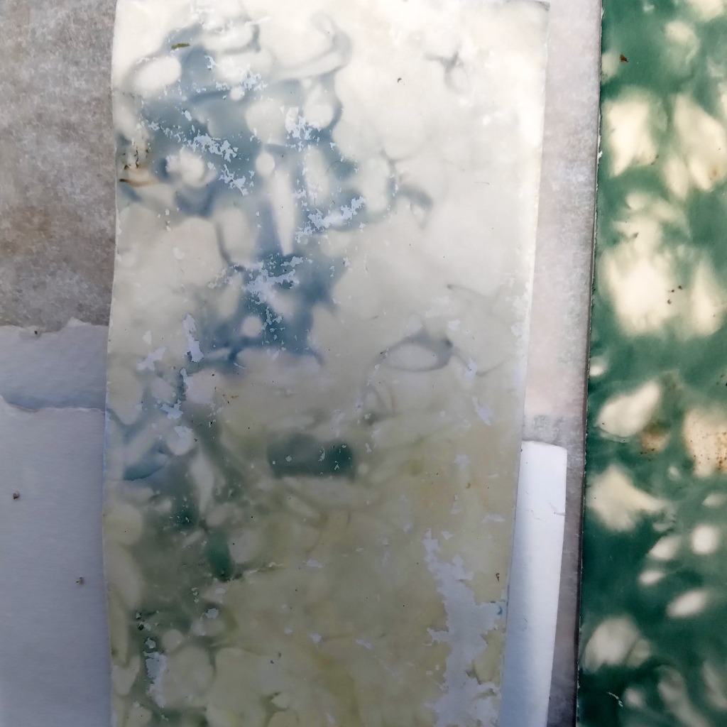
Imagine my disappointment on the very next day, when I went back to my dye studio to admire those blue tones I had just made. And they weren’t there anywhere. All violet and blue tones had turned into very strong green – in a way that made the original dye on the paper appear blue. Compare this photo below to the one that is first in this post – it’s the same paper.
I still need to test this more. Maybe this happened since the paper itself is alkaline buffered archival art paper, which probably tries itself to move from acidic side towards basic, which might explain this color shifting happening.
The next step I’ll probably do, is to make a more “traditional” anthotype emulsion by fresh flowers without making a dye out of them first, and then use it with common not alkaline-buffered aquarelle papers.
And I also need to finally calibrate my pH device which measures the pH from the surface of paper. If this has gone the way I think it has (the paper itself turning acids into basics), the result would be then very usable for my projects and it is really not a bad green at all!
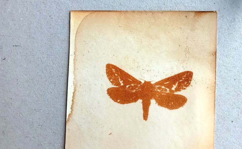
Alder bark exposure
Until a few days ago it hadn’t been very sunny at all for weeks, which made me wonder how my anthotype prints have developed. I’ve checked them once and a while, but I have not removed the films to see how the exposure has worked. I’ve actually thought that the colours haven’t really been changed a lot during this one month exposure time.
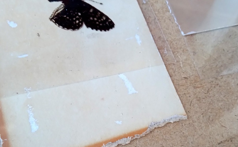
For some of the prints I had selected quite light dyed paper according to the main colour of the butterfly I was printing, and since there are over sixty of these, I don’t remember the original shade of each print. It was also the case with this print: I had an idea of this being one of the light butterfies and that the paper hadn’t exposured a lot. Yesterday I accidentally dropped the exposure frame and I had to move the film and paper to another frame since the glass was broken.
Then I also noticed that the corner of this paper had been under frame and not exposured – and this print that I thought had not been exposured a lot, has actually done quite an opposite.
These prints and dyes always surprise me in several ways. This paper was originally dyed with alder bark, which I have thought to be very lightfast dye. To get this strong colour loss in just in a month time in cloudy time (with only a few sunny days) suggests strongly just the opposite.
Last year I noticed that coffee and tea dyed papers were among the first ones to fade, and this was a big surprise for me. I’ve always thought that tannins are generally quite lightfast, but it seems that they really are not.

Midsummer garden lupine dyeing
For about a decade right now I have had at least one day in summer, when I have tried to dye paper blue or teal (or turquoise / aquamarine) with garden lupines (komealupiini; Lupinus polyphyllus). I have successfully dyed yarn samples in several shades of blue and teal, but paper – never. However, I know it is possible, since I’ve seen it happen (just can’t remember where it was and who was dyeing).
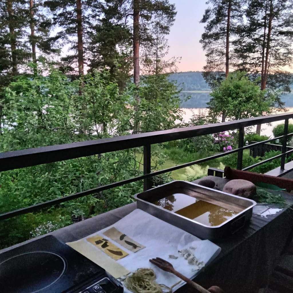
As said, I have tried this several times and it’s often midsummer days when this happens annually. A lot of magic goes with midsummer eve traditionally, often something to do with flowers (pick seven different plants and put them under your pillow to see your future loved one), but it’s also the few days in the summer that there seems to be endless time for everything. I personally love to spend my midsummer at my childhood home, which is located next to a lake and has a specific place in balcony, where I can play with dyes and enjoy the nature at the same time. And then there’s this long long summer night, not entirely sunny through the night, but almost – this upper photo was taken at midnight.
I didn’t have seven plants of spells in my repertoire, but just four: I started with lily of the valley (kielo, Convallaria majalis) – for years I have actually thought it’s protected so I haven’t picked it, but I just learnt this year that it isn’t and it grows very plenty at dad’s backyard; then I continued with red clover leaves (puna-apila; Trifolium pratense) which are actually gigantic this year; and then leafy hawkweed (sarjakeltano, Hieracium Umbellata) – I haven’t found a lot of information of it used as a dye plant, but several years ago I just tried dyeing with it and I got really stunning bright yellow from it! There’s also plenty of dye in the plant, since I picked only about fifteen of these (just from closest backyard, to test if I remembered right), so, just about 50-100g (estimate) and the dyebath was more vivid yellow than using ten times more some other plants. I’ll post some photos of these three plants later.
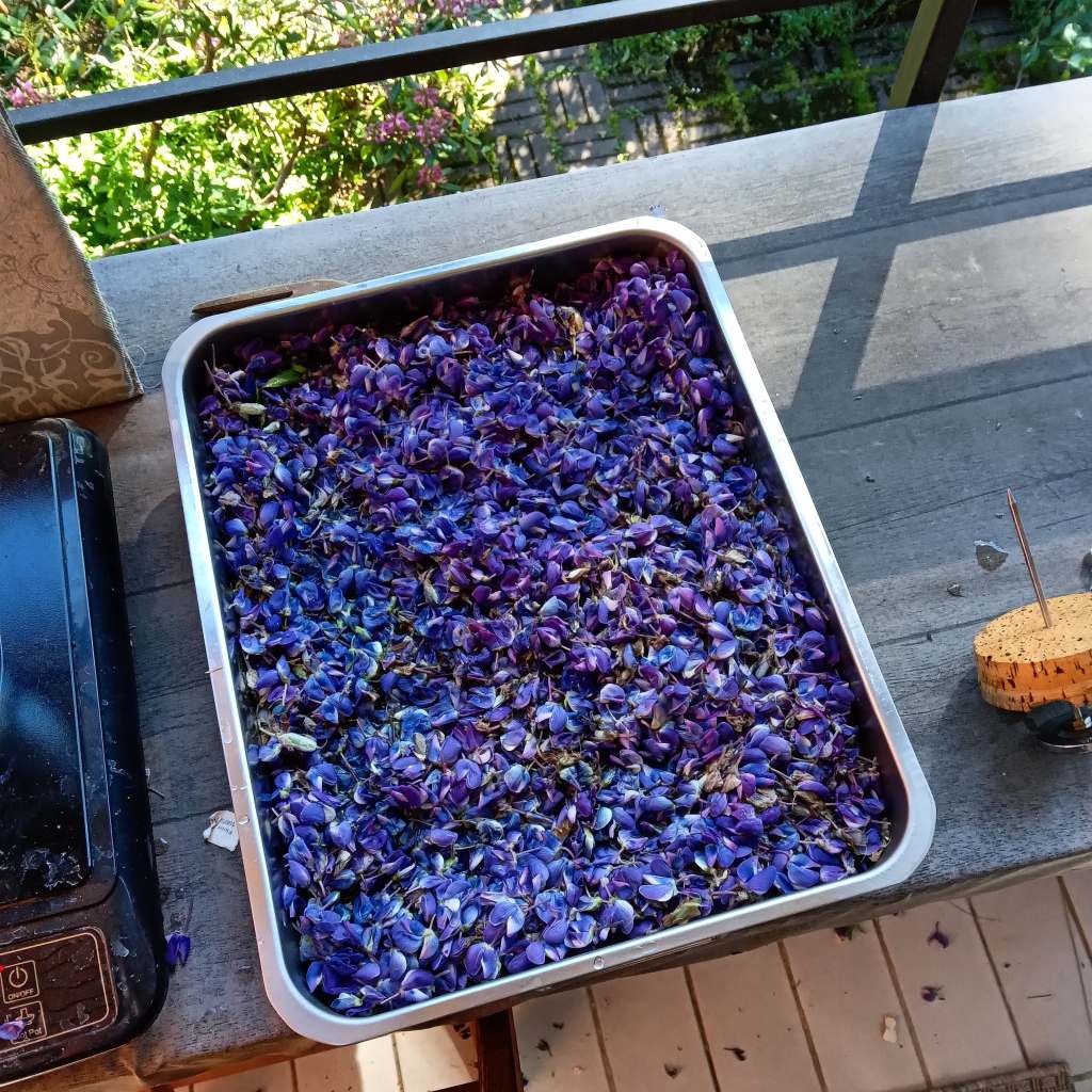
But then to my quest for blue. I know lupine blue isn’t very lightfast, but as I need blue tones for my anthotype projects, that would actually be the point. To get blue, you need to pick ripe blue lupine flowers and separate them from stalks. There are often flowers not yet opened at the top, and they (as well as stalk and leaves) contain quite strong yellowish dye, so if you don’t want green, be sure that your bath only contains these blue flowers. Also, the flowers must be used as fresh as possible. If you pick flowers in morning and dye in the evening, it just might be too late to get the blue tones. Lupine also kind of soapifies very fast, so if you leave it for the next day, you might get slimy unpleasant mass instead of dye…
As I dyed paper I used flat casserole tray for dyeing. I placed the papers on the bottom, flowers on top of them and poured water in. In my many tests I have noticed that the only way to get blue to yarn is to dye them simultaneously with flowers, because in this slow dyeing method the blues have vanished at the point when straining would be possible. For dyeing paper in this way, it often means that the result won’t be even, but for me it isn’t disadvantage but quite the opposite!
I placed the tray on stove and set the temperature on 50 degrees C and I kept it there for two hours. I didn’t actually have to keep my stove on after heating, since it was so warm at the balcony, that the sun warmed the steel tray and the dyebath had lowered just to 45 degrees after two hours! I then left it there for over night.
No boiling then at all. The heat destroys blue pigments and as I have very delicate thin papers in my dyeing materials, I wouldn’t want to rise the temperature very high anyway. I have noticed earlier that for yarn you get more bluer tones in low temperatures (a bit warmer than luke warm), but they stay quite light even if you soak them longer. Rising temperature to 70 degrees or higher starts to give you notable greener shades. So I had my fingers crossed…

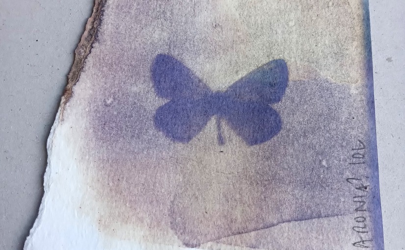
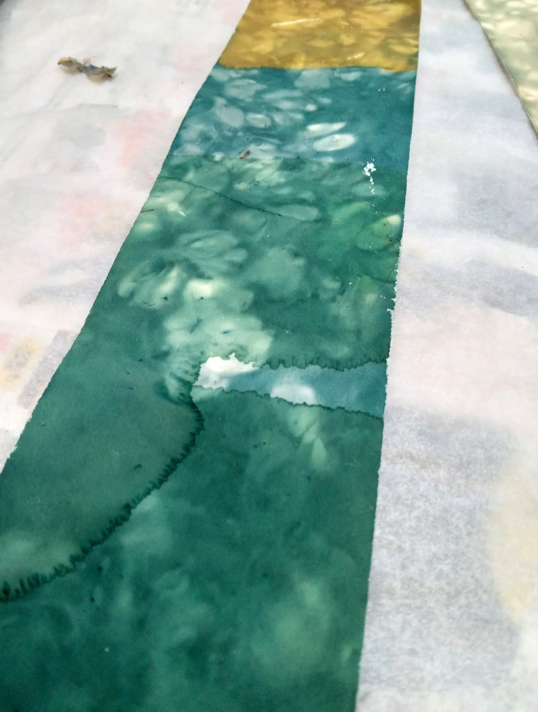
This green paper on left is the one I picked up after two hours, when I just couldn’t wait. It’s beatiful bluish green with uneven pattern made by lupines at the same bath. On the right side paper which was on dyebath until “the end” and which actually was teal colored – but more green than blue anyway. Here you can also see three yarn samples of which the bottom one is petrol blue – the others are not so much. (I was dyeing paper, but I can’t help tossing in my small dye sample bunches with various yarns both not mordanted and mordanted in several ways… but I’ll make a post of them only later.)
In my sample yarns I have paper labels attached to them, and they were actually very pretty light blue (there’s a hint of it showing in this photo above; in real life there wasn’t really a green tint on them).
The Hahnemühle photo rag paper dyed very well, though not as blue as I wished for. Dyeing other papers was quite a disappointment, since the ones I really wished to dye – lokta (photo below, up left) and shiohara kozo (photo below, down left), weren’t dyed practically at all. Fabriano aquarelle and Fabriano Accademia drawing paper were actually most successfull tone-wise: they are both very light blue without any greenish tones, but so so so light that they look almost colourless. (I took the photos in very strong sunlight: the green line at the top of photo is a shadow of a balcony rail, not dye…)

So, not succeeded with blue this time either. But that one paper in right corner is in real life starting to be quite close. And, as said, these photos were taken in very bright sunny outside light when these samples were still wet. I need to take another look at them in more netural lighting conditions…
As it’s the best days now to pick the lupine flowers, I’d really like to give them another go testing still a bit more lower temperature and longer soaking time, but with other tasks waiting to be executed, I’ll probably have to wait for a week at least. Hopefully it’s not late for this summer then.
May weeds
The spring came late, but when it came, it all happened fast… I wanted to pick early leaves and stalks of plants for testing and suddenly I had 24/7 dyeing going on (and no time to post about them)! These were the first samples I made from very very small amounts of dye material – from weeds on my way back home from my studio a few weeks ago.
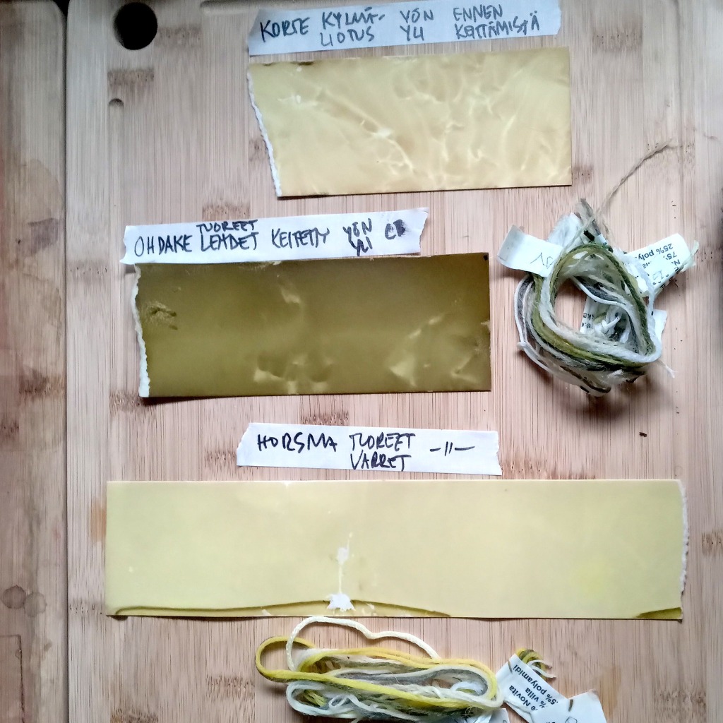
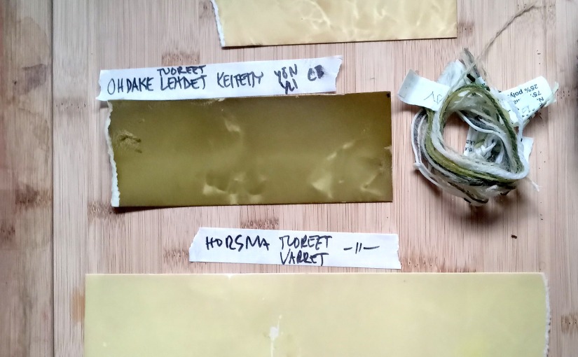
First of the three samples here is horsetail (korte, Equisetum – I can’t tell these horsetails from each other – my friend guessed that most likely it is either E. sylvaticum or E. arvense). I couldn’t heat up all my collected material at once, so horsetail had to wait for over night. I placed the material soaking in water and tossed this piece of paper with them (contacting with horsetails made this light texture on paper). So this was before boiling in lukewarm water for over night.
The middle one is from boiled burdock leaves (reads ohdake, but is really takiainen in Finnish, Arctium – the same as horsetail, from these leaves only I can’t tell the species one from another). I had only a couple of leaves picked, but the dye was really really strong and vivid green. After boiling I left the leaves still soak in water for over night and this paper and yarn samples were in the same “cold” bath.
The one in bottom is willow herb (fireweed, maitohorsma, Chamaenerion angustifolium, before Epilobium angustifolium), also boiled; paper and yarn samples added after boiling and left in cooling bath for over night.
(After these samples I rised the pH of both horsetail and willow herb dye baths to bring out more colour – more of these experiments later.)

Borago
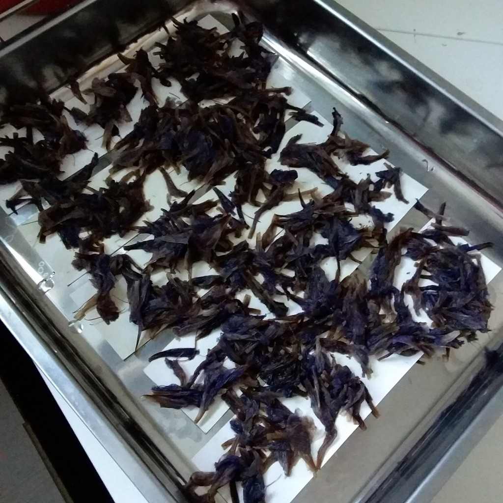
Borago (Borago officinalis; rohtopurasruoho, purasruoho, kurkkuyrtti)… It is said in one Finnish herb info page (#yrttitarha)that this old medical plant was cultivated in old Nordic herb gardens for a hundreds of years ago. It’s also described borago to be both garden plant and suitable for salads and as spice. However, it’s stated in Finnish Wikipedia page that it is toxic and that’s why it shouldn’t be used in salads… Yrttitarha doesn’t really say anything about the toxicity of the plant, except in the final chapter, which states that because of some harmful alkaloids, (here in Finland) the dried flowers and leaves can be sold only in pharmacies. Well, I bought a 50g bag of them in some grocery selling middle eastern foods… (I can’t remember exactly where, but the price was 3 euros).
I didn’t really know what I was buying. I know that borage is related to alkanet, but I haven’t really read about it as a dye plant. (As I googled fast about it, I noticed that there have been some studies of its use in dyeing, but it’s clear that it has been widely used.) I just saw the blue flowers and as I need to dye some papers blue I wanted to test them. (And of course I know that blue from flowers isn’t lightfast – I need some quite fast fading blue for some of my anthotype prints – in one series where the level of lightfastness is part of the work.)
I kind of had an accident with these. I had planned to separate flowers and leaves and then soak them in cold water only, but somehow I forgot my plan on the way (too many simultanous projects…) and they ended up all in same soaking jar. I noticed that picking up wet flowers from the mass was quite frustrating, so instead I divided the mass in two halves.
I just left the other half to soak in cold water and I heated the other half of the soaked flowers+leaves to make a dye (I brought it up to +80C and turned the heat on and let them soak) which turned fast very deep, beautiful brown. I placed shiohara kozo and a lokta papers to soak for over night – and the next day I was very disappointed when it looked like they hadn’t dyed at all. The dye bath was still beautiful deep brown, so I decided to try out with Hahnemuhle printing paper (over night in cold bath) – which turned out richly brown. (Is it the coating of the paper? Or the alkalinity?) The gloss on the photo below is from the wetness – after drying the paper will be matte and probably a bit more darker.
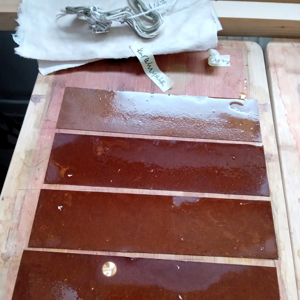
After making a dye I placed the boiled flowers on paper under the pressure for over night – and I was pleasantly surprised with the outcome. These print beautifully! The imprint of the boiled leaves and flowers, however, is quite one toned. (I don’t have photo of these.)
After soaking the other half of the flower+leaves in cold water for some time, I also used them to make contact print by placing them on paper and under pressure. This was more colourful, as the heated water hadn’t killed the colour of the flowers! It wasn’t blue, but still very beautiful. (View the main image)
I haven’t yet tested how these will work for my anthotype purposes, but that’s the next step.
Notes to self: I need to try to find more of these: I’d really like to try to extract the colouring of the blue flowers with alcohol to see if that brings out the blue dye in them! The dried ones were sold out from the spice shop and probably there won’t be more, so… (Also, I need to see, if there are fresh ones somewhere available…)
