Differences in paper colouring techniques II – Staining by contact

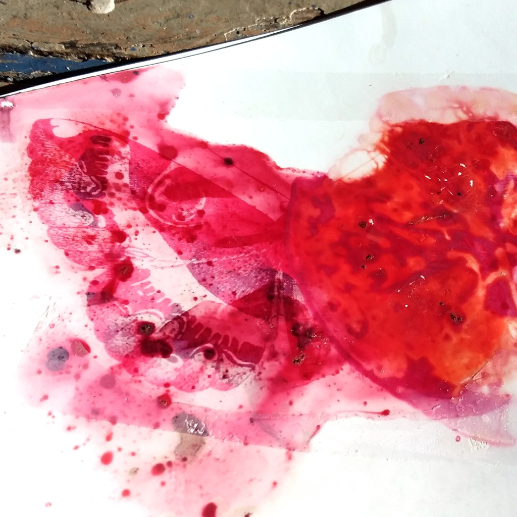
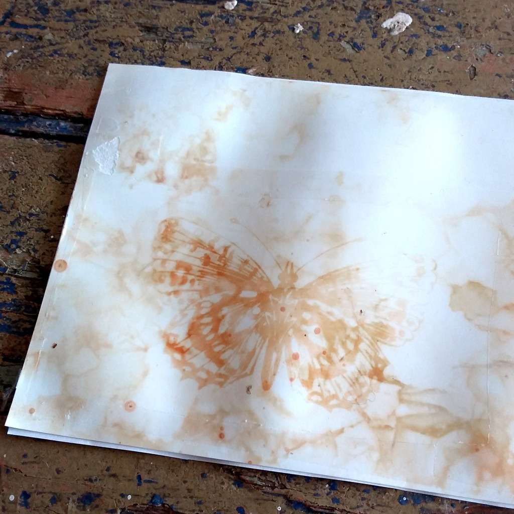
Staining the papers by laying dye materials upon it for over night works well with several materials, and it’s worth while if you wish to make uneven, texturized papers, and with some materials and dye matters also by imprinting the texture of the material. The featured photo, and all the other webcab photos in this page, are from 2011, when I started to stain papers with bloodred webcaps (Cortinarius sanguineus, or Dermocybe sanguineus) and surprise webcaps (Cortinarius semisanguineus, or Dermocybe semisanguineus).

The process is pretty easy: the moist dye matter is simply set upon a moist paper, they are covered with plastic (to keep the whole thing from drying), and some weight is put upon them for the print to attach. Let it be over night. More detailed instructions can be found for example in the Sweet Waste Dyes guide which can be freely download at suloisiavareja.wordpress.com site.

In this technique the papers are not boiled or even heated, so it is very suitable for even the most delicate and thin papers.

And, in this technique the paper used and also the amount of moisture used affects on how the print will look like.

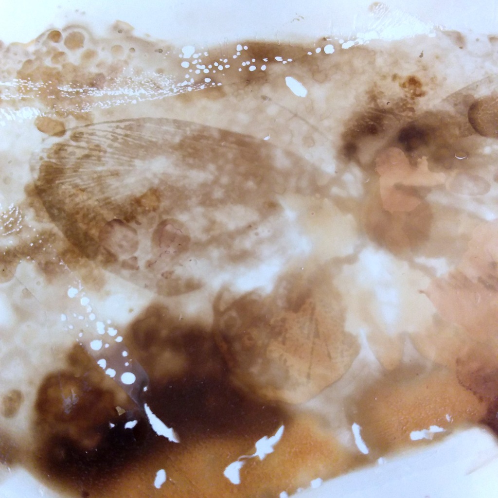
With moist dye stuff but pretty dry paper, especially the glossy photo printing papers will make sometimes very detailed imprints, but when there is more moisture, the results may be very aquarelle-like, and even something that looks very three-dimensional. Depending, of course, also from the paper brand. (Below is an anthotype print made on red onion skins contact stained glossy photopaper.)

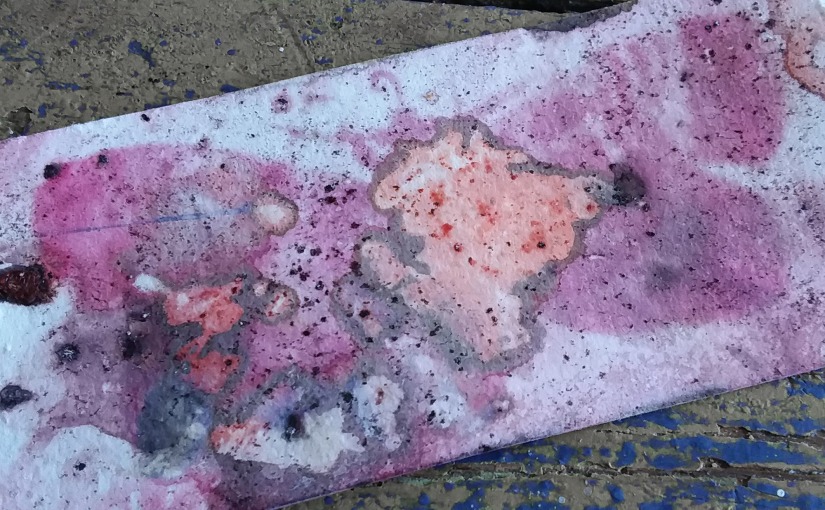
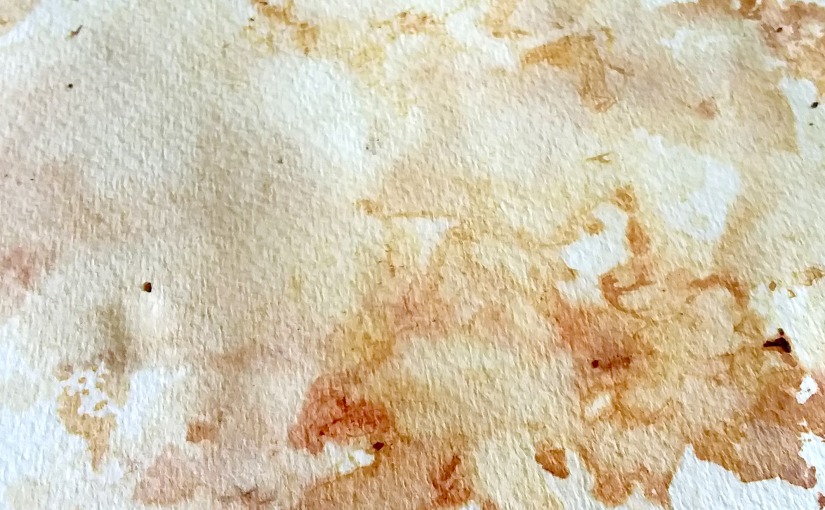
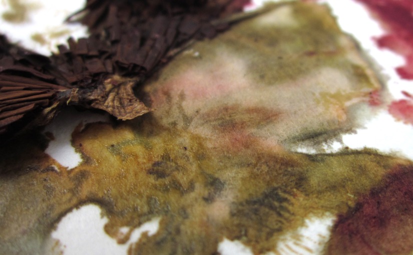
Using more soft papers (like aquarelle papers) and lots of water, will provide less-detailed, aquarelle-like surface like in this paper stained with mushrooms in 2011.

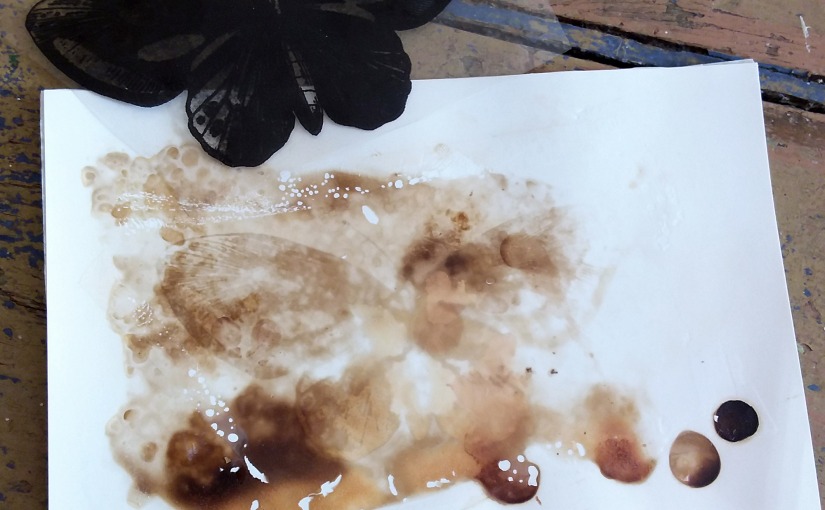
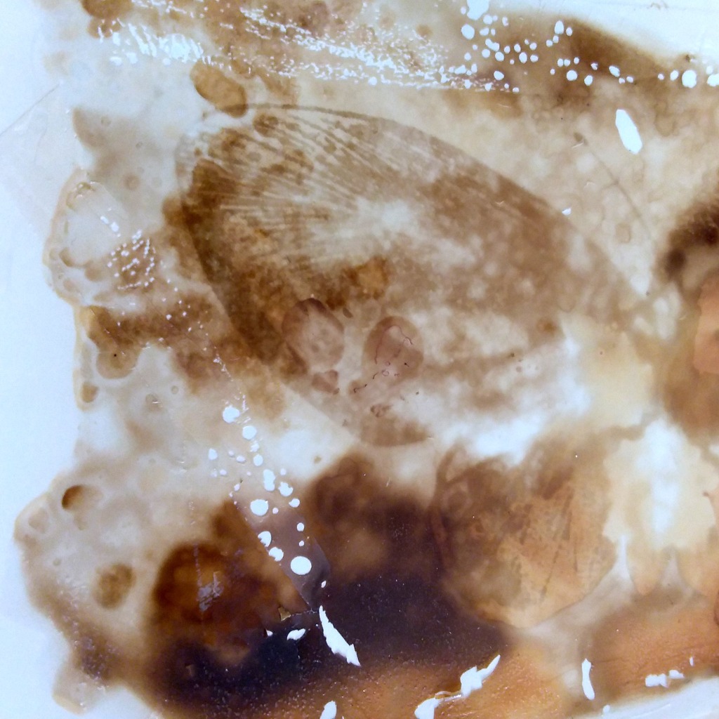
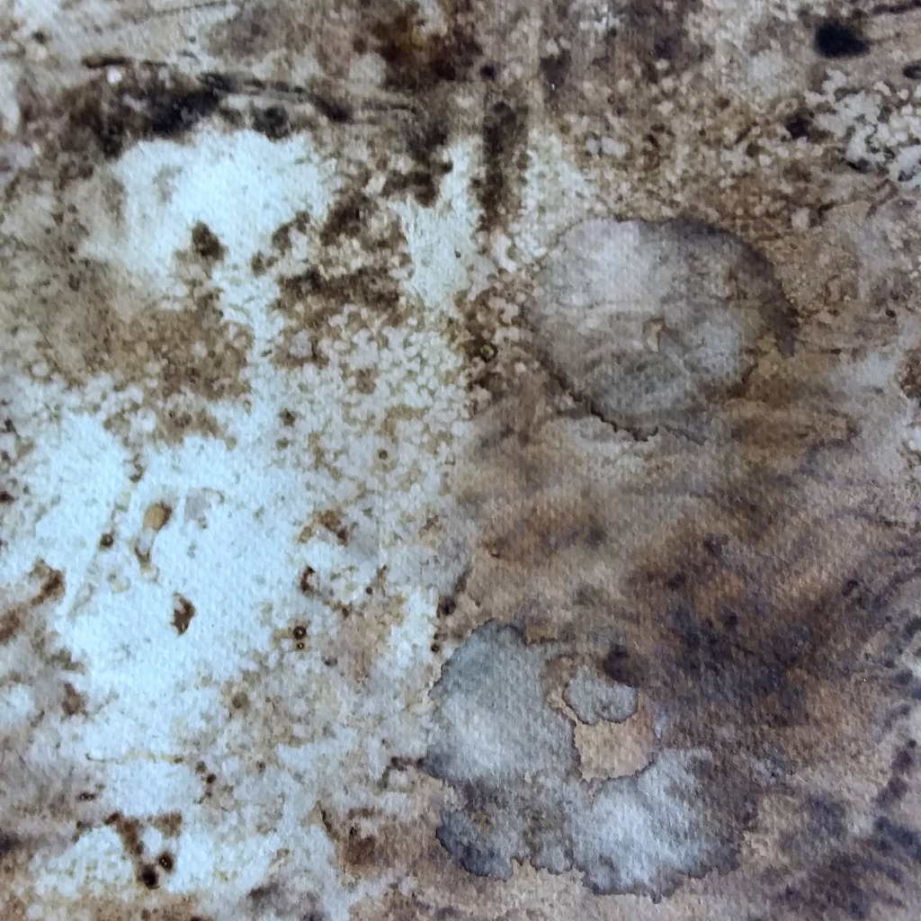
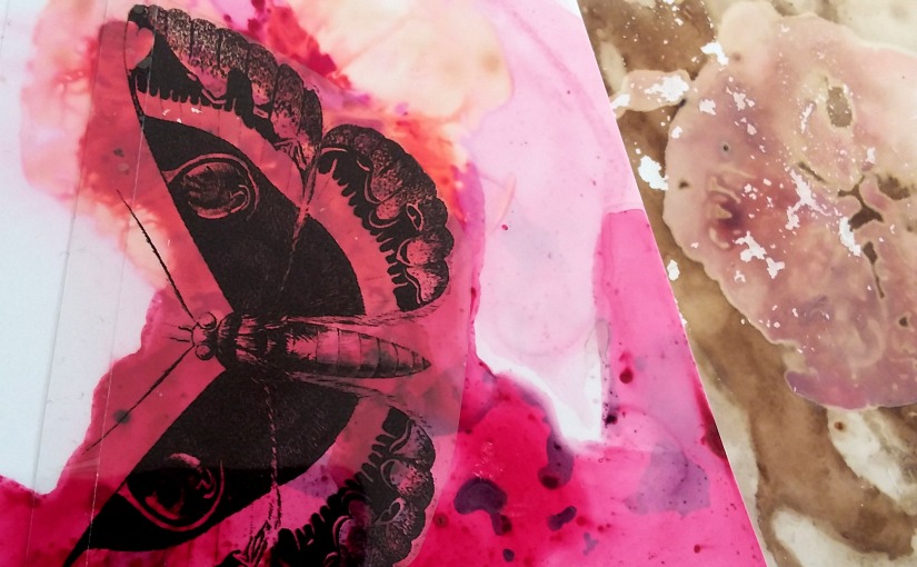
…Or, you can try to adjust the moisture levels and create both aquarelle-like and detailed prints on the same paper, as in this mushroom example below. On the left side of the paper both the paper and mushrooms were very wet, but on the down right corner you can see, what happened, when the paper was only slightly moistened and moist mushrooms were laid upon it.

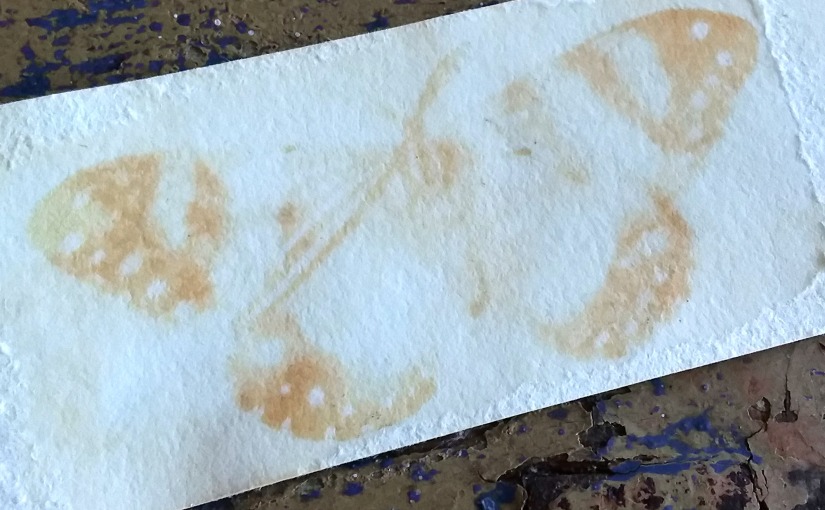
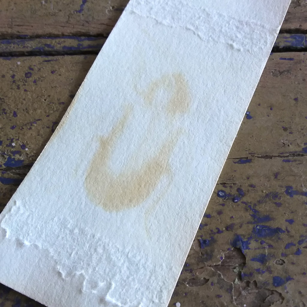
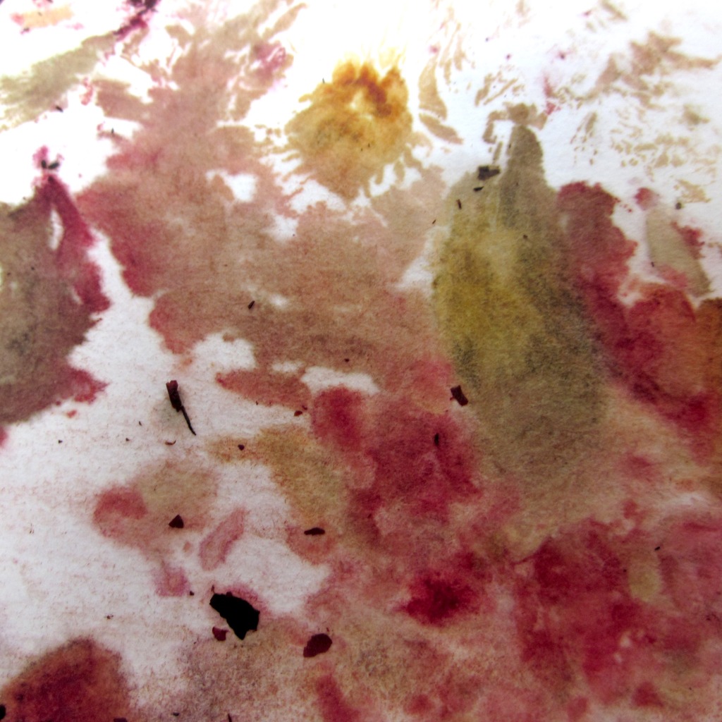
The best papers for contact printing depends on what you want, really. I have tried out several papers, and I can say only, that every one of them works out differently. You just have to try out the best way to work with each one.

Cochineal, results

These samples were one of my old paper staining tests, where I’ve laid the dye material on paper.

The print in featured image was made on Hahnemühle photo rag ultra smooth printing paper. I usually don’t use much chemicals – other than lemon juice as acid, baking or washing soda as alkaline for colour changing tests, alum for mordanting when dyeing yarn, and possibly vinegar in some cases. However, in this case I made some tests with ferrous sulphate which you can spot of the darkened marks on paper.

As cochineal is considered quite lightfast, it was a surprise for me that I could made an imprint of the butterfly with anthotype.

I’ve known that it’s very easily affected by acids and alkalies: pH neutral is quite red, acids turn it towards orange and alkalies towards purple. In these both prints the orange is due to lemon juice – in the photo below (a print on glossy photo paper) I’ve actually place half a lemon or round lemon slice to the paper, which you can easily spot.

It’s interesting to notice that the anthotype has been exposured well on red and purple areas but the orange areas seem like they haven’t been affected at all on the exposure. If you would make any observations on these two sample papers (which is certainly not enough to make any definitive conclusions!), it seems that cochineal treated with acid is lightfast, but without treatment or in alkaline surroundings it is not.

This is good news for people dyeing wool, since wool don’t mind acidic surroundings. But this is bad news for people working with cellulose fibre papers, since colours should always be acid-free to not harm the papers, and if these papers are now acting normally… Then again: good news to someone who’s making anthotype prints (where the image is meant to fade) but doesn’t want to harm the paper itself.

Yellow onion skins anthotype

I’ve loved working with onion skins, since they yield so much dye, and because of the natural tannins (in yellow onion skins, at least, the actual dye matter being pelargonidin; 3, 5, 7, 4 tetrahydroxy antocyanidol), you can dye wool in very deep colour even without mordant. I’ve known that they are not amongst the commercial dyes, and I haven’t bothered myself to find out if this is because they are so readily available everywhere (which would make them quite a poor merchandise) or because they are just not really good quality in dyeing. I’ve heard a lot of about onion skin dyes not being lightfast at all, but I’ve dyed a lot of wool with onion skins and I haven’t really paid any attention to their fading. Then again: if my woollen socks (which I wear on darkest winter time, usually at home in the evenings) are dyed with onion skins, they don’t really get so much day-light, and even less direct sun light.

But now I know: the lightfastness is actually really really poor. In just about two months exposure time the unprotected background of the exposured images lost all colour. Which makes this perfect for my anthotypical project.

But it also means that I should be careful not to over exposure them. The print in the image above was exposured for about two months, and this one below just over week longer time. They are both Hahnemühle photo rag ultra smooth paper, dyed (not stained).

Below was also a yellow onion dyed Hahnemühle photo rag ultra smooth paper, but in a bit more shadowy place. I’m amazed how well the details were printed in this (the image is about five centimeters high).

As I did tell in my earlier postings, I’ve “stained” or printed paper not only by dyeing or brushing dye upon them, but also with placing onion skins directly upon them. This one below is glossy photography printing paper, which has been first stained by placing moist onion skins above it for over night, after which I’ve placed the film upon it and left it for exposure for two months.

Dreamy prints on glossy paper

When I first experimented with this contact staining with natural dye stuffs about ten years ago, I found glossy photo paper to be my favourite of all, since it really makes a three dimensional effect (it looks like the dye goes partly there somewhere under the surface) and, when successful, the details of the matter contact stained can be very sharp.

I then liked especially staining with onion skins (both red onion and yellow onion), because with them you could actually talk more about printing than staining… That is, if you used a lot of water or laid the skins to very moist and soft paper, the result was really staining: colourful patches of dye where the onion skins had been. But by using less moist and glossy photograph printing paper, you could get the imprints of onions. Sometimes just their shape in general, but sometimes the prints were so detailed and sharp, you could actually see the detailed lines of onion skins.

The papers coloured this way are already looking very three-dimensional, so I actually adore the anthotype print made on these papers.

The only thing is, that I’ve run out of the glossy photo paper I originally used, and the ones I’ve tested later are not so good in quality: they wrinkle or lose their glossy surface when moistened. But the search is definitely on!

Red onion skin anthotypes

Red onion skins are one of my favourite both in dyeing and contact staining, since you can get so large variation of colours from green to red and pink to really dark brown. At the same time I know that they are really easily affected by acids and alkalies, and not so lightfast, so I thought that they would be great for my anthotype testings.

These samples all were exposured for about two months. As I now take a closer look on these, I can see red onion skin dyed and stained papers are very suitable for anthotype, as I had thought, but they have also faded to be more monotonous colour. I kind of expected that colours (especially pinks and reds made with acid) vanishing, but not in the scale it had happened.

Above (headline / featured image) is an imprint on Hahnemühle photo rag ultrasmooth printing paper and below a print on glossy photo paper. The film wasn’t so tightly upon the papers, which makes the imprint a bit unsharp and a bit dreamlike (an effect of which I actually truly like). These both papers were coloured by contact staining: the colour was not dyed nor brushed on paper, but the onion peels were placed upon the moist paper and left there for over night for the colour imprint to form. And they both were very vivid and colourful, tones changing from bright green to pink (which was made by acidic lemon juice) before exposure. The colours are browned through out the images.

This makes me wonder, if the print below, which I had marked as red onion skin dyed Hahnemühle photo rag ultrasmooth paper, is really red onion skin, since the green is still quite green and not brown in anyway. Or maybe it’s just that in this case the film has been close enough to the paper and there hasn’t been any light leakage on the covered part. You can see, that the exposuring has been quite strong, because the background is almost colourless (the whole paper has been originally the same colour as the butterfly).

And this is the second image I’m guessing, if I have marked it wrongly. It clearly says red onion skins on the backside, but maybe this is yellow onion skins? The orange tone clearly looks more like the colour of yellow onion skins. The print is very clear though, on Hahnemühle photo rag ultra smooth printing paper, originally throughout dyed and the background faded absolutely white.

I need to re-make a batch of both yellow and red onion skin dyes to make new tests. It’s obvious that both are very suitable for anthotype: giving strong and vivid dyes and fading very fast. I just want to test, if the paper which is used can affect to how the green tones will fade.

So, onion skins, still my favourites!

Cortinarius / Dermocybe anthotype

When I started the exposure, I found a couple of old aquarelle papers, contact stained already about eight to ten years ago with Cortinarius / Dermocybe mushrooms (the first dried, then wetted mushrooms were placed on paper under pressure). There were both Cortinarius semisanguineus = surprise webcap or red-gilled webcap (verihelttaseitikki) and Cortinarius sanguineus = blood red webcap (veriseitikki) on all of these papers, but mainly semisanguineus, which also provides a lot of yellow tones (in addition to those blood red ones). These papers have been stored in dark box for all this time, and they were vividly red before I set them to exposure three months ago.

It was no surprise that I wasn’t able to make anthotype print with these aquarelle papers. But I was surprised anyway.

Originally I thought that I wouldn’t get the anthotype print since these mushroom dyes are really excellent in lightfastness. I didn’t expect them to fade a lot, and that’s why I had a long three months exposure time.

When there was not exposured anthotype image visible after exposure, I thought that it was just this reason: no fading at all.

But then I noticed that the other paper (in main image) was really, really faded, there just was not an image.

Then I noticed another thing: the paper was vividly red before I set it for exposure. Where are all the red tones?

Please, view my blog entry from the beginning of May to see the example of how the headline featured image looked before exposuring. Comparing the images you can see, that originally there have been some red areas for example which have vanished totally, without leaving any mark of them being there. This was really a surprise to me.

And then there is this other one (below), where I have used also iron – the grey round areas are webcap caps pressed on paper, and before exposuring this paper, they were dark red. There’s absolute no redness left in this paper at all (if anything, there is now a slightly greenish tone). I can tell that the tone of the dye has totally changed, but I can’t really tell if the colour has faded or not. But also, not any kind of anthotype impression neither.

I’m partly very disappointed about this. I sort of was thinking that the dyes wouldn’t fade and I could then use these mushroom dyes to make permanent pigments – but now it’s obvious that I can’t use them for my other art projects at all, with this fast fading.

Note about papers

As I now removed the first few well faded sample papers from my sunny window, I also noticed the difference with my test papers. First I thought that at least with this first batch it seemed obvious that the papers meant for photographic printing acted best for this purpose. The clearest imprint was in Hahnemühle Photo Rag Ultra Smooth and in some general glossy photo print paper (the featured image of this posting – I’ve picked the sample papers from my trash, ripping slices from used printed papers, which is why there is some text printed!) Which I thought was, because they are very smooth papers… and there was almost no imprint at all in Hahnemühle 425 aquarelle paper.

But come to think of it: as the films weren’t pressed tightly and weren’t propably in contact with paper, there was probably a high light leakage into the area being “hidden” from expose. I noticed for example that this film of butterfly I’ve used with heavy aquarelle paper is not probably the best one to make any assumptions, as it’s clearly an film that should be used in a way that there would not be any light leakage at all.  When I rised the levels of this photo below in Photoshop, I could see that there are some kind of outlines of the butterfly on the paper…

(It’s no news to me that as this was not evenly stained paper, the veins with more pigment on them have not faded a lot – but it just accured to me that maybe this is a effect that I could use in final art prints in some way.)

2020-05-26-12.32.34

Cochineal butterfly

This is also one of the old samples I found from my old project box: cochineal stain on glossy photo paper. It has been on dark archive box about eight years and the colours were saved very vivid and bright. I’m interesting to see, if the dye will then fade on sun, since there are very opposite opinions on this, other saying that cochineal is lightfast, others saying that the lightfastness is really poor. I get it that when dyeing yarn, the yarn itself (if it is wool, silk, cotton, linen or something else) and the mordant used affect to the lightfastness a lot. I wonder if the paper I’ve used also affects. This one is cochineal stained on glossy photo paper, which is not often so good quality as the matte art papers. I just don’t have any cochineal stained matte art papers at hand right now, but I will make them at some point just to find out the difference.

If this works in anthotype (ie. if the colour will fade on sun), this would be very interesting dye to use, since the changes in pH will affect it so easily. In acid it will turn yellow and alkalines turn it purple. I’ve used only mild household chemicals for this, lemon juice for acids and baking soda for alkalines, and it’s relatively easy to make very vividly patterned papers with just one dye.

Using alkalines and acids to tweak paper won’t matter in this anthotype project, since the prints are not meant to be last – anthotype prints are temporary images anyway.

(The paper on background is stained with red onion.)

Pretty and versatile red onion

I’m also using some older stain samples for my project. These red onion skin samples have been made in our Sweet waste dyes – recycled colours in use! (by textile artist Ulla Lapiolahti and myself) project from 2011 on, and they have been saved quite well, as they have been stored in dark archive box. The only thing is, that the stained very green tones on the glossy photo paper have been turned to a sort of brownish green (not so brown as in this photo), but on the other hand, the bright greens dyed on Hahnemühle photo rag ultrasmooth paper are still green. Interesting to see how the sun light exposure will affect them.

But what’s more interesting are the shades which you can obtain from red onion skins (just by boiling them). Here the three solid squares are all made from the same bath in which I also dyed wool (without any mordants): if you put a lot of the red onion skins and the dye is very “thick” you may get very dark shades, from deep purple to purplish brown, and actually the square sample on the bottom is really very very dark brownish purple.

Then you can re-use the dye bath for the second time, which will give you lighter tones, and just keep re-using it until no dye is left… and as you re-use it, the dye will turn more green every time (also alum as mordant will affect on to this, but if you don’t want to change the pH of the paper). And as it is often with natural dyes: no, it doesn’t work every time and the result may always be a surprise.

The difference with these older red onion skin dyes compared to the ones I made now is, that this spring I boiled the onion skins but used then cold dye bath for papers, the earlier ones are made in hot dye bath.

The paper below is made by staining with red onion skins and then stamping on it with lemon juice (using potato as a stamp). Since the dye is very easily affected by acids and alkalies, you can see the result here easily – lemon juice is acid and turns the green tones to pink and red.

(The other old samples I used for this first test batch are for example pomegranate rinds, nectarine stones and Dermocybe mushrooms, just to mention a few.)